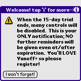
This is the very first thing users see when entering the application. Why are you "guiding" the user in how to use the (i) button? They know how to use it, there's no need to guide them and point it out, especially on the titlebar. Do you see Windows applications saying " Click the [X] button to close this window. You can find it over here ---> ". No, you do not.
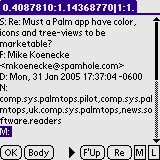
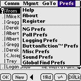
Why are these headers abbreviated there? Don't do that. If you're going to show what is contained in the headers, show it, don't abbreviate it. Is the "F:" supposed to mean "Follow-up:"? "From:"? Other?
There's a few issues here:
- Dont' use words like "Cool" on your buttons. If this is supposed to be a quality application, worthy of using in a commercial environment, use "Ok", like every other Palm application in existance.
- People who are used to using Palm handhelds, don't need to be guided at every step. They know where the (i) is, to get more information. You don't have to explain it in text AND provide an arrow/map, to point it out. It looks amateurish.
- You don't need to use the word "Copyright" and the © symbol at the same time. People know what it means. Use one or the other. In this case, using © would give you more space on the form to work with (as would removing the "http://" prefix on the web addresses and putting the build date into the titlebar of the form, instead of that "About:tap '(i)'" string.
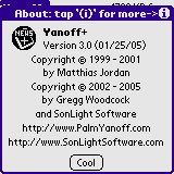
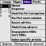
In general, you don't want your "About" and "Register" options to appear in a "middle" menu. Either stick them at the bottom of a far-right menu (ala Windows), or put them at the top of the far-left menu (ala OSX). Also, you're using "MIDs" here, when you should be using MsgId. There's enough space on the menu, use it.
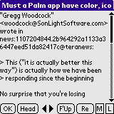
- Why does this button say "F'Up"? Did I "Fuck Up" something? Does tapping this "Fuck Up" something?
- Why is there an "Ok" button here? What question am I responding "Ok" to? This should say "Back" or "Index" or something similar, not "Ok"
- Use the available space. You can use the full term "Newsgroup Prefs" or "Group Preferences" or some other combination there, without any problems.
- There is a much better way to organize prefs (using a form resource) instead of this confusingly-long menu that almost wraps onto the buttons below it.
- This one goes without saying, but don't write "sentences" across your buttons here. It looks amateurish and doesn't improve the usability of the application at all. Since this is the main screen users will first be presented with, you're going to cause them to run away before they even have a chance to "like" your application.
- Also, this first button says "Register", and yet tapping it does not allow me to register the application. I know its part of your scheme to convince the user to register, but it will only piss them off. If you label a button, make that button do what the label says.
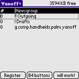
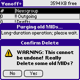
This one ties into the above screenshot.. tapping on the "Register" button (which is what most people would do to... wait for it.. Register your application), throws the error regarding deleting old MsgIds. If you're going to require that the user's register before the buttons will work, don't make the buttons work anyway. Its misleading. Either the buttons don't work until registered, or they DO work, even if unregistered.
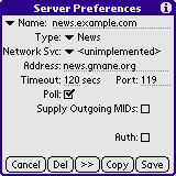
- Another obvious No-No. Don't add "Unimplemented" features into your production application. If it doesn't work, it doesn't belong in the application. Users are PAYING for this application. Don't give them an application with obvious "Unimplemented" features.
- Also, this exact form has a few usability issues. Where is the "New" or "Create" option to create a server? It isn't obvious how I'd do that. I had to fumble around to figure out I had to change the "Mail" option dropdown, erase the name, and then change the port, to add a news server. You're not using all of the availalbe form space here (like "Auth", where it could say "Requires authentication?" or something similar).
- The form isn't laid out in any functional way. There are irregular dropdowns, three text fields, 1 centered checkbox, and then 2 other checkboxes, but right-justified. It looks horrible.
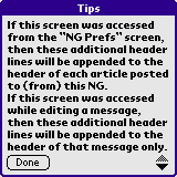
What exactly is this for? Freeform addition of headers, obviously. Isn't that clear? No, it isn't. (See next screenshot)
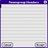
Is it "to" or "from" the newsgroup? Pick one, and be consistent. Also, note your inconsistent placement of "Cancel" vs. "Done" and "Accept" buttons. Look at any HIG (Human Interface Guidelines) for why moving these buttons around is a bad idea.
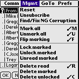
This one is a bit odd, but goes back to the inconsistent state of the application. Why is there a "Register" option on the Mgmt menu, and also one on the Prefs menu? (tapping either of them does absolutely nothing at all, so I can't even access the internal Info to tell me what the difference between the two of them is)
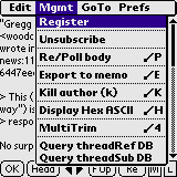
But now over here, "Register" is missing from the Mgmt menu. Is this the same menu? Or a different menu? BE CONSISTENT!
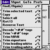
- What is all of this silliness? You're complaining about the size of your prc, and yet you have a Rot13 function in here? I know you can create a 1 line Rot13 function in C (and I have), but what good would this possibly have in a Palm newsreader? Is there really that much need for this? Are there Rot13-only newsgroups I'm not aware of?
- The 'Trim' options on this menu can be consolidated into one menu option: "Trim..." which pops up a form asking the user what to trim, with checkboxes "[x] MIME [x] Signature [ ] Leading whitespace [ ] Trailing whitespace" for example. Much more intuitive, keeps the menus unclutterd, and makes for a much more pleasant experience.
- Also again, refer to the HIG for placement of the "Edit" menu. I haven't found a single application where "Edit" is the leftmost menu.
- When selecting all of the article text, you pop up an alert if it exceeds the maximum memo size, but you don't tell the user that NONE of the text was clipped or truncated. You don't even copy it to the clipboard at all. Not exactly the desired action. Also, why limit it to Memopad? What if I want to paste it into something that CAN handle more than 65,490 bytes? Memopad is only limited to 4k if you want to edit the record, but 65,490 bytes if you do not. Your use of this "feature" is incorrect.
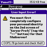
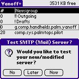
Another perfect anti-HIG set of options. Why does this have three options? Either you want to test "Now", or you do not want to test now ("Later"). Isn't answering "No" the same as answering "Later" on this dialog? Or do you actually schedule a test? No. Make them more consistent please.
Related to the previous screenshot, tapping on "Later" presents me with this form... and an enormously-long button, where you guide the user where to go, but you indicate that this is a "User Input Error!". Is selecting "Later" really an error? I don't think so.